HOT OFF THE PRESS!

HOT OFF THE PRESS!

We supply expert advice on exterior color to homeowners, business owners and property managers alike.  We also give our input on the process of consulting and how best to assist our clientele to those who are involved on the labor side of things, the painters and paint stores.

In this month's Paint and Decorating magazine, Melanie Moul writes about our conversation on the business of color and how best to aid those involved in the process of repainting in the article "An Expert Perspective on Color."  


Branding the Way We Live

Branding the Way We Live

We are seeing a heightened awareness from consumers about what they want in a product these days. Buyers desire a truly unique touch and reflection of their own personal tastes in everything—from food to clothing to the cars they drive.

This need for individualized experiences and personalized purchases bleeds into the crafted lifestyle concepts that we are seeing more of in single and multi-family housing.

The trend is toward designing, building and renovating buildings in a highly stylized way for all types of residents. There are themes branding the overall architecture, not to mention interior and exterior color. The community and family aspect is driving a branded and experiential development. 

Along with this more holistic and connected system is a great need for color. We are seeing color being tied to the entire community whether it's an apartment property or a new homebuilder project.

It's uniqueness that managers and developers are using to attract residents and that is where we, as color consultants, play an integral role. It is exciting to see this market driving the need for color and the use of color in more sophisticated applications.  We are your ambassadors for color and it is our goal to design successful and sustainable color schemes for all kinds of building exteriors.

Historic Color

Historic Color

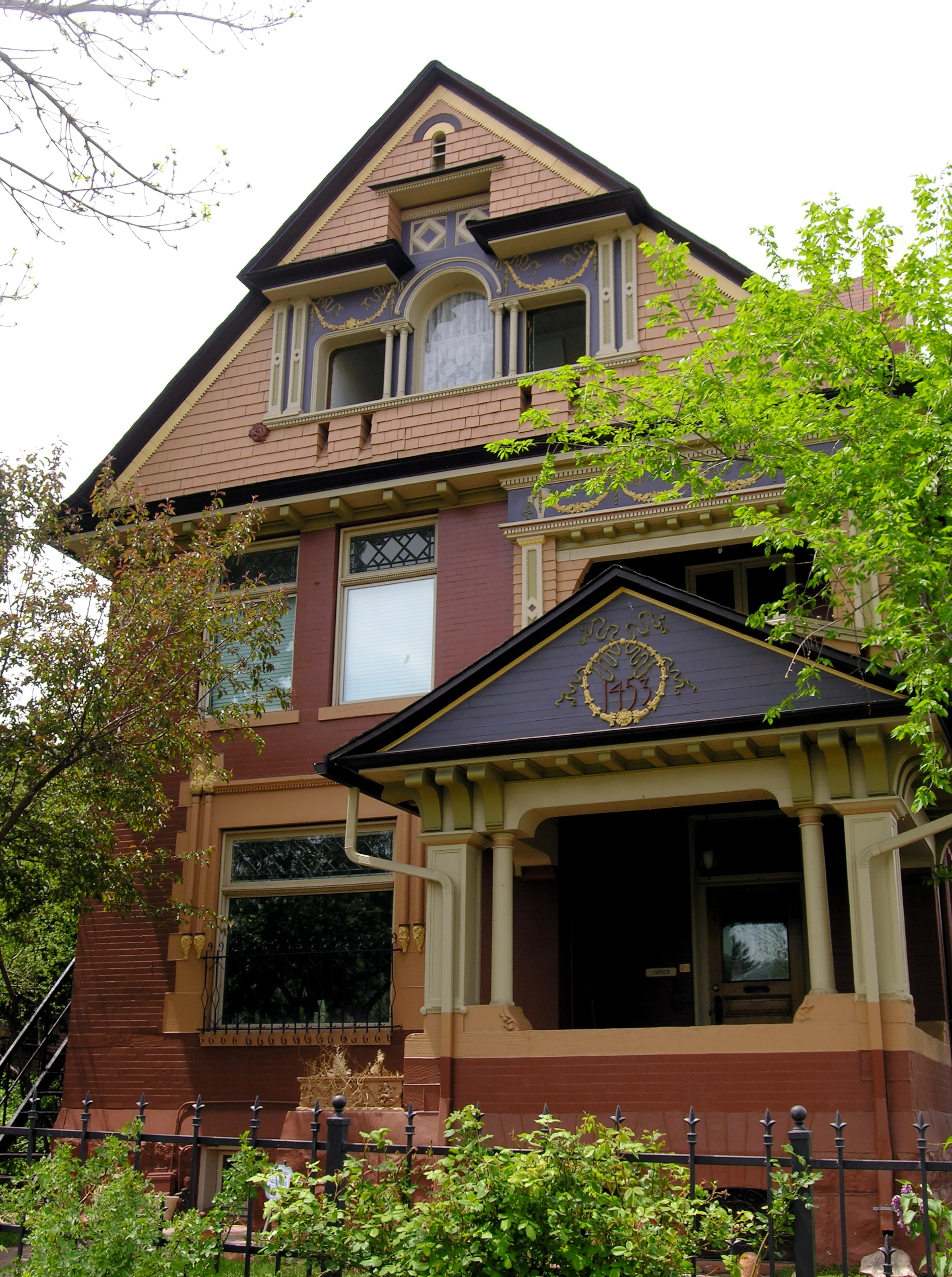
At a time of the year where we are getting lots of calls from homeowners wanting to make the most of the painting season, we still hold a special place in our hearts for those who are managing historical renovations. These can be particularly challenging and extensive and most who are involved have been so for many many months, if not years.

We have been designing exterior color schemes for historical properties for over 30 years and we continue to be amazed at the architectural majesty of homes and businesses and commercial properties in historical districts all over the country.

We have been involved with historical color services in online and print publications to hopefully inform homeowners and give them as much information as possible to get them started and headed in the right direction. We also are listed as a resource for various media outlets. One of these is through the Preservation Directory. We know this to be a great platform for people involved in many parts of historical architecture and development and even for DIYers.

Check out the website Preservation Directory and find us in the listings for Preservation Businesses under Historic Color Services for Colorado. And have a happy and successful renovation season!

Finesse at its Finest

Finesse at its Finest

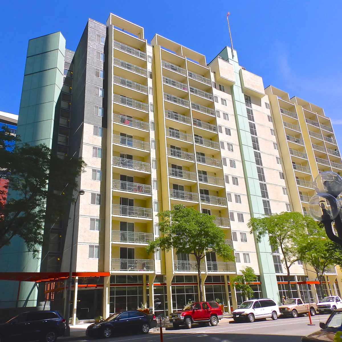
Sometimes a complete overhaul can be a scary picture to paint for community managers. The success of a multi-family property's re-branding is more often in the finesse of color correction. Using the existing architectural elements and even the current theme or tone that has been set can be the most effective and economical way to add curb appeal.

This article we published in Units Magazine, "Color Correction," and the example used within it is a great representation of working smarter—and using a level of finesse in exterior color design that is savvy and conducive to our client's needs.

The creative solutions we bring to the table as architectural color consultants do not only allow for a positive ROI for owners and managers—they set communities apart and ahead in the market.

In Our Opinion

In Our Opinion

Most people would say that we have a pretty strong opinion about the color White. When we were approached by The Wall Street Journal to give our take on the white-walled leanings of social media platforms such as Instagram, we got the chance to explain our misgivings on this particular trend.

Read The Wall Street Journal article by Abbey Crain, "Why White Walls Are Instagram Gold" and find out why we disagree with the popular staging techniques and what direction we offer instead for greater success in the use of color.

Making an Impact on Buyers

Making an Impact on Buyers

As with any project, shopping centers are multi-faceted in their approach to marketing. There is a similar concern for curb appeal as with any business or residential property interested in attracting buyers. We work hard at creating a design solution steered at making the right statement for property owners and feel that the use of color is the most effective way to do this within a budget. 

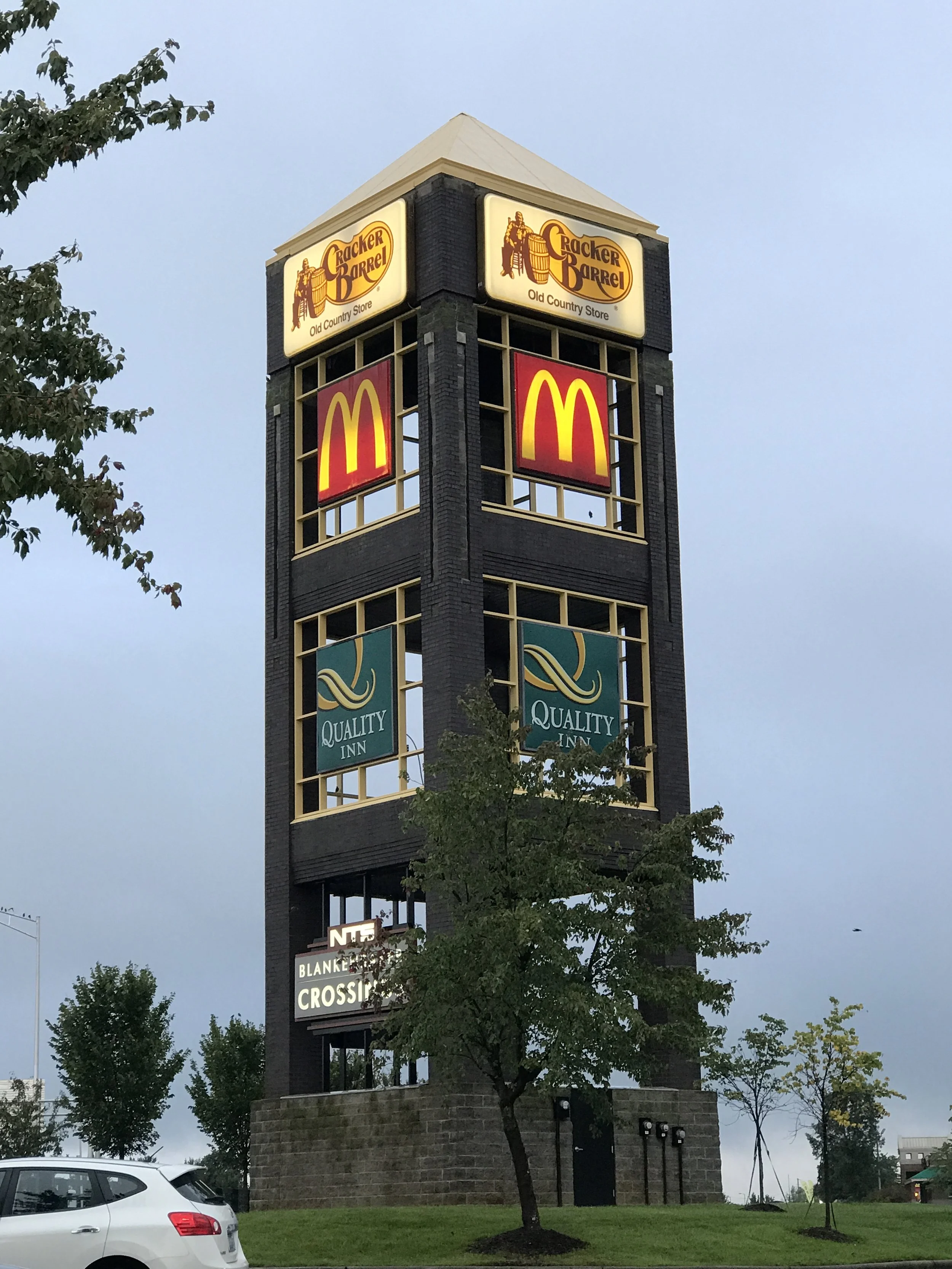
Retail needs to be a bit muscular. There needs to be a nuance to exterior color choice for these particular buildings and it will be absolutely critical to its success in drawing potential customers. Read more of our thoughts on “The Color Factor” in the retail environment in this article in Buildings magazine.

Here is an example of how a center’s monument sign gained new life as we packed some punch into its signage and allowed this marketing structure to make an impactful statement with color.

We have Doors!

We have Doors!

We have been strolling the neighborhood for signs of new growth. This is an area of great diversity and there are homes being renovated and parks being constructed. There are bike lanes being added and food trucks being converted into restaurants. It is busy! And that is great news for us business owners and in general, for those of us invested in this thriving cultural scene.

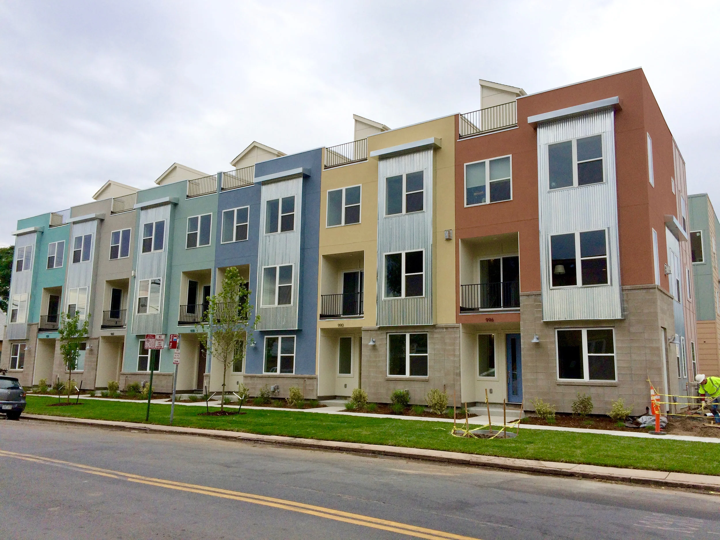
We blogged about the row homes we designed exterior schemes for and promised to update you with their progress. Well... WE HAVE DOORS! And dogs in the windows and all kinds of activity on the street front. It seems they have attracted a number of folks interested in living in the thick of the city and in the heart of a great art district as well. Our colors seem to be setting the right tone and appealing to a great community—and that was exactly our hope for this project.

Enjoy these updated images! 

PRO TIP: WHY USE SATIN

PRO TIP: WHY USE SATIN

Reasons to use a Satin finish instead of a flat finish on buildings (Commercial or Residential):

 - The colors look richer and have more life.

 - The finish is stronger than flat.

 - Flat finishes have a tooth which holds dirt. The shinier finish of satin paint allows the dirt to wash off making your buildings stay cleaner and feel newer.   

Telling A Story

Telling A Story

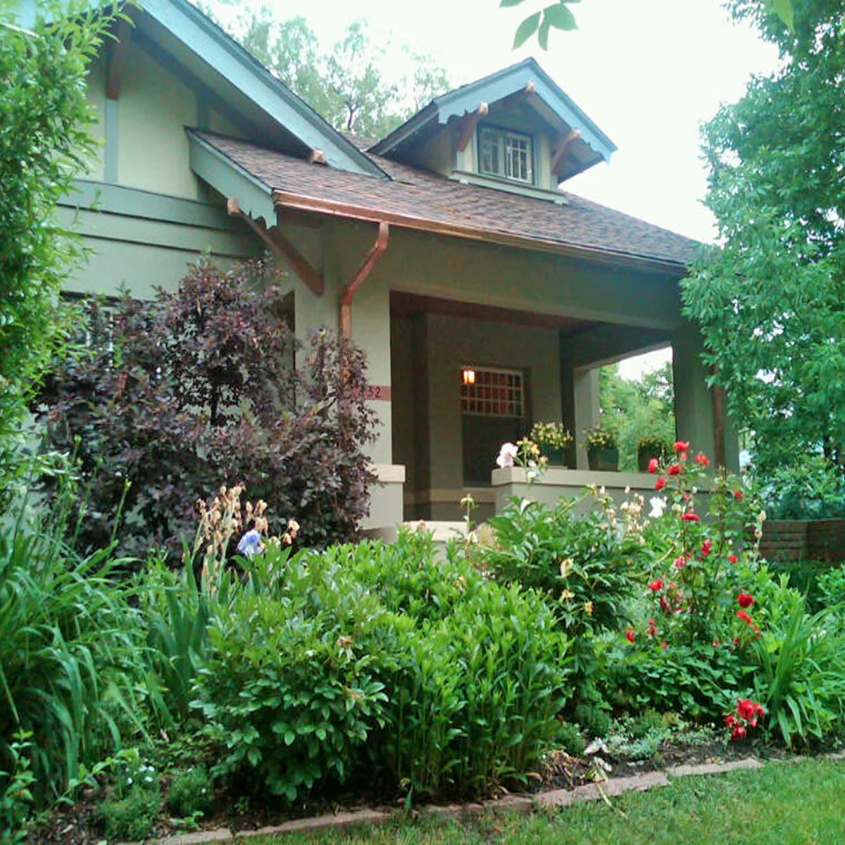
When we begin the process of consulting with a homeowner on a new design scheme for their home's exterior, we look at their photos first—or in many cases, here locally—we visit them at their home so we can see it in person. Our clients are tasked with providing us with a visual story of their home—and they usually do a thorough job as it is something they look at and notice daily.

We try to really take in and imagine what this home looks like—both as a whole composition and also in its parts and pieces. The architecture reveals itself and therefore so does its story. This is the place where our design direction takes off.

The first thing we do is ask ourselves, "What is this house trying to say?" There is always a prominent message and our path to color is inherently grounded in this statement.

With this story in mind, we then investigate what the homeowner has relayed to us in their questionnaire. They have responded to questions on color, mood, surrounding environment and desirable degrees of detail. There are usually more clear responses about what people don't like and that can be just as helpful.

Our next step—the critical one and the true design challenge—is to take that initial story and translate our client's needs into that. Our goal is always to have our homeowner be happy everyday they come home—but we also are architectural color experts and ultimately hope to present the true message of what that house can be. It is a wonderfully unique and creative solution that is required and that we strive to provide for our clients—AND is the reason why our role is so important as Storyteller/Consultant/Designer.

Art Row in Progress

Art Row in Progress

We were hired by a developer to consult on the design and exterior color for a community of new row houses in our neighborhood. We work in a designated design district of Denver and love to be involved in local work affecting our area's unique character. It is a lively, culturally rich and artistic place and it was vital to relay this in our design solution for this housing project.

There were many different materials to coordinate and work with—including stone, siding, windows and roofing—so the overall concept needed to be cohesive with all of these selections. The placement of color was an important decision grounded in emphasizing the architecture of these buildings and also in making the right statement to its users.

We came up with selections in materials and a palette of colors that gave life to this unique community. Our intent was to create a perfect street and neighborhood presence and to be able to attract the right customer base for our client.

The project has been underway for several months and we have been excited to see it take shape. It has just reached the point of color sampling and now we are even more anxious to see it completed—and to watch as it takes off in this thriving market.

These photos give a sense of the process and some of the steps going on within this and other similar consulting projects for new developments. Continue to follow us on our blog and social media for more updates on this vibrant community.